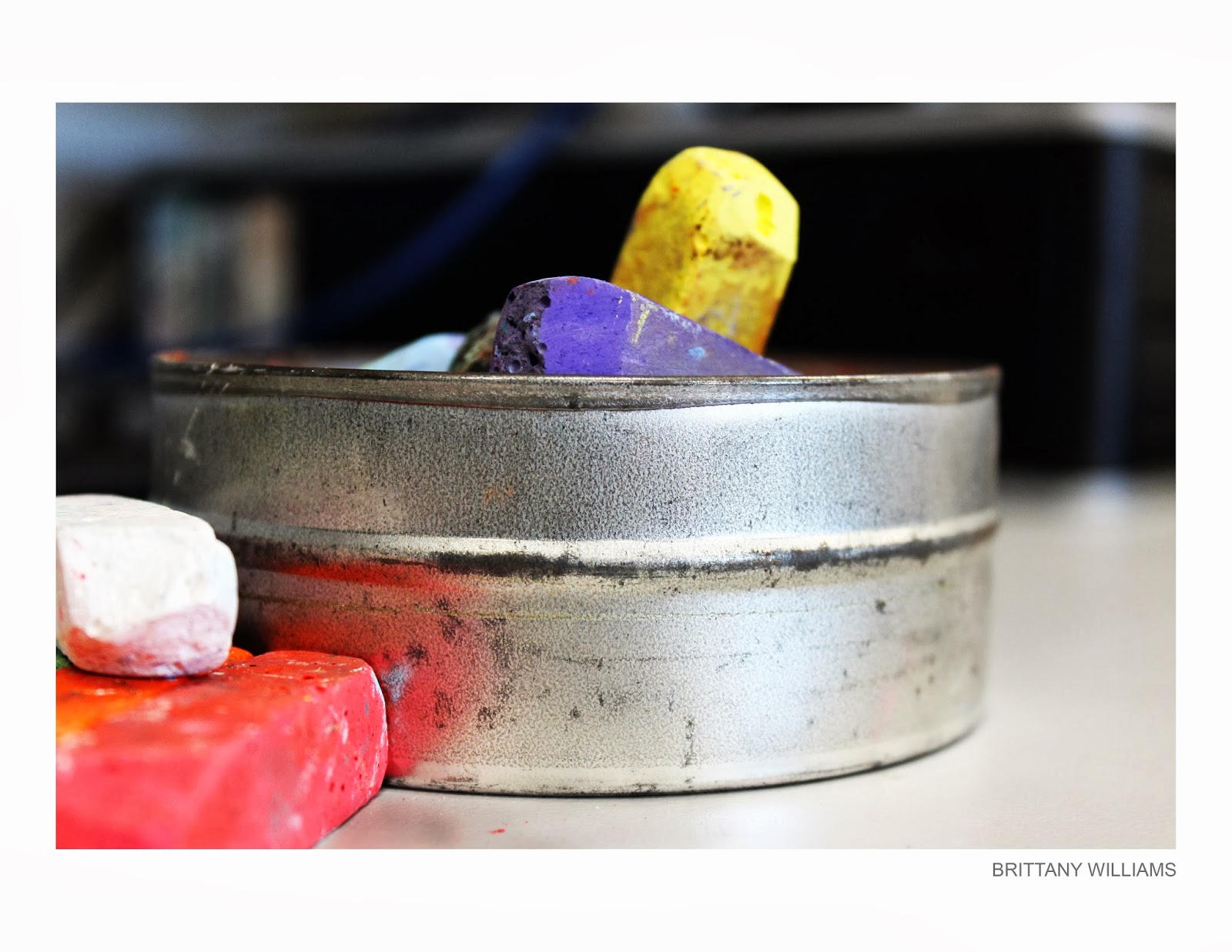
Some examples of analogous colors.
Monday, October 14, 2013
Analogous Colors (Pre Assignment)
Unlike Complementary colors, analogous colors are the colors next to each other on the color wheel. This will probably be easier to do than the complementary colors assignment because i think there will be more natural situations around me. One thing that worries me is that if i don't figure out a great composition my calm inviting image becomes plain and boring. A great way to grasp this assignment was to go to http://www.photographyicon.com/analogous/.
Some examples of analogous colors.
Complementary Colors (Pre Assignment)
this assignment was to go out and find complementary colors in situations, even if you created it yourself. Because complementary colors are opposite, they give images great contrast in color. 10 images of colors and their opposites may be hard because i feel like generally when combining colors you would want them to flow into one another. A few black and white images will be accepted but it could be too easy if those were the only colors you chose. I think this will be a challenging assignment because there aren't many interesting subjects so i will have to create my own. Below are some examples of complimentary colors
Tuesday, October 8, 2013
Imogen Cunningham
Imogen was born in Portland, Oregon in 1883, where every
summer she took reading and art lesson paid for by her father. Majoring in
chemistry in 1906, she was inspired by Gertrude Käseb, to take up photography
again. With the help of her chemistry professor, she began to study the
chemistry behind photography and she subsidized her tuition by photographing
plants for the botany department. Later she opened a portrait studio in Seattle
which won acclaim for portraiture and pictorial work. Most of her work at the
time consisted of people in their homes,
in her living room, or in the woods surrounding her cottage. The next year, she
married Roi Partridge, an artist. He posed for a series of nude photographs,
which were shown by the Seattle Fine Arts Society. Imogene took a greater
interest in pattern and detail and became increasingly interested in botanical
photography, especially flowers. Between 1923 and 1925 she produced an in-depth
study of the magnolia flower. Later she turned her eye towards industry,
creating series of industrial landscapes in Los Angeles and Oakland. I like
this artist because i love taking pictures of plants and growth. I also would
like to further my knowledge in botany.
this is photographer Ansel Adams, i chose this picture because it was a more free and fun looking pose than some of the others photographed by Imogen Cunningham.
succulent plant
I like this image because I enjoy its organic nature and have photographed similar subjects.
A Visit to Dr Sooy, 1973
I think this image is very intense. Now i don't think this is the case but when i first look at the image I think of a creepy mental hospital with evil doctors with fake smiles, and suffering patients. this image is just so mysterious and draws you in.
Source 1
Just some pretty flowers
| Camera | Canon EOS REBEL T3 |
| Focal Length | 35mm |
| Exposure | 1/200 |
| F Number | f/7.1 |
| ISO | 800 |
| Camera | Canon EOS REBEL T3 |
| Focal Length | 37mm |
| Exposure | 1/200 |
| F Number | f/5 |
| ISO | 3200 |
| Camera | Canon EOS REBEL T3 |
| Focal Length | 43mm |
| Exposure | 1/640 |
| F Number | f/5 |
| ISO | 1600 |
| Camera | Canon EOS REBEL T3 |
| Focal Length | 46mm |
| Exposure | 1/4000 |
| F Number | f/5.6 |
| ISO | 800 |
Monday, October 7, 2013
Geometric Shape Patterns
Geometric shapes are everywhere we go, so why not photograph them! I observed repetition in many different environments at home and at school. Some of the pictures I chose may not quite fit the assignment perfectly, but I really enjoyed taking them and trying to create a meaningful composition. I really love the idea of this assignment, and its limits. It could be a very simple and in your face idea, or it could be a complex series of different ideas complied into one great image. When doing this assignment i tried to think about everyday objects that are geometric shapes, that also have shapes within them.
| Camera | DSLR-A100 |
| Focal Length | 70mm |
| Exposure | 1/60 |
| F Number | f/5.6 |
| ISO | 400 |
| Camera | Canon EOS REBEL T3 |
| Focal Length | 34mm |
| Exposure | 1/13 |
| F Number | f/4.5 |
| ISO | 800 |
| Camera | Canon EOS REBEL T3 |
| Focal Length | 34mm |
| Exposure | 1/30 |
| F Number | f/5 |
| ISO | 800 |
| Camera | Canon EOS REBEL T3 |
| Focal Length | 47mm |
| Exposure | 1/40 |
| F Number | f/5.6 |
| ISO | 800 |
| Camera | Canon EOS REBEL T3 |
| Focal Length | 50mm |
| Exposure | 1/25 |
| F Number | f/5.6 |
| ISO | 800 |
| Camera | Canon EOS REBEL T3 |
| Focal Length | 39mm |
| Exposure | 1/30 |
| F Number | f/5 |
| ISO | 800 |
Thursday, October 3, 2013
~ White On White Continued ~
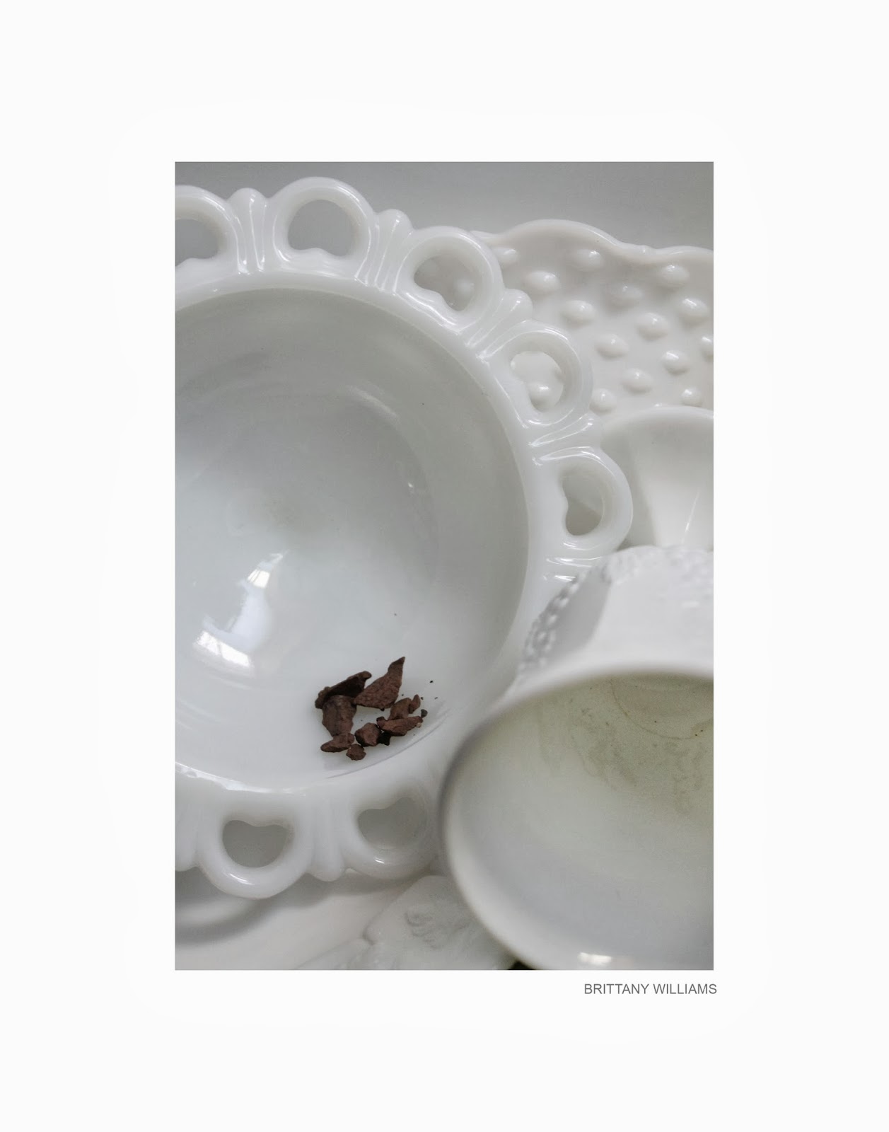
So to personally continue the white on white challenge (photographing white on white subjects and situations) I took to my home and searched for pure white objects. I came across some white plates and bowls my mother recently picked up from a yard sale, and utilized them to the best of my abilities. I photographed them in front of my washing machine making it even more challenging to give my subject the correct color it needs and also keep its details while being against a background the same color.
| Camera | Canon EOS REBEL T3 |
| Focal Length | 34mm |
| Exposure | 1/40 |
| F Number | f/5.6 |
| ISO | 1600 |
| Camera | Canon EOS REBEL T3 |
| Focal Length | 39mm |
| Exposure | 1/30 |
| F Number | f/5 |
| ISO | 1600 |
| Camera | Canon EOS REBEL T3 |
| Focal Length | 39mm |
| Exposure | 1/25 |
| F Number | f/5 |
| ISO | 1600 |
| Camera | Canon EOS REBEL T3 |
| Focal Length | 40mm |
| Exposure | 1/50 |
| F Number | f/5 |
| ISO | 1600 |
Tuesday, October 1, 2013
~ White On White Minimalism ~
for this assignment we were to take white objects and put them in a situation with a white background. To get the white object to be its correct color in the photo, you must adjust your white balance according to the lighting, and overexpose the image. i found shots at different angles needed different exposures, sometimes less, sometimes more. my shutter speed was set to the lowest it could go, and my ISO was set between 200 and 400. The subject we used in class were white roses against a solid white background. these are my own photographs, but they have not yet been edited because Photoshop uninstalled its self on my computer somehow :( I will be uploading my personal white on white subject pictures soon once i am able to edit again at home!!
Subscribe to:
Posts (Atom)